Tuesday, September 11, 2007
Rationale 
This is my final logo design.
Let me first touch on the character itself.
Character DesignEnvironment: Cottage candy house
Looks/Personality: Adorable, bubbly, fun-loving
Fetish: Sweet things like chocolates, candies, biscuit wafers etc..
I want to portray the girl as a fun-loving and bubbly person, hence, I drew her in an adorable way, and that explains my use of colours as well.
Bright orange, yellow, green, red and blue are being used.
This would hence draw attention of people, especially my targeted audience, which will generally be the kids.
As a whole, the drawing style and colours usage are actually my personal style.
As you can see, there are circle of lines as the back of the character design.
That is actually a huge lollipop behind her, which reflects her love for candies.
In addition, you can also tell from the two "candy rubber bands" on her hair.
And you might have noticed that there are tones only on the character itself, and not on the huge lollipop that is behind her.
Why is that so?
The reason is because, I want the main focus to be on the character itself, hence, without tones on the lollipop would make the background look much flatter, and at the same time, not to steal too much attention from the character itself.
In this logo, I incorporated my chosen designer, Noel Martin's style's use of symmetrical lines in his logo designs as my fusion.
As you can see, when a vertical line is drawn in the centre of the logo, it divides the images symmetrically.
Hence, this is how my logo design turns out after fusion.
As this is a logo design, it relates to branding, which in turn got me into doing some merchandising products for my logo design.
In addition, the creation of the character itself leads to my area of specialization, which is animation.
Hence, there are some merchandising products that are being shown in the post below, to help promote for my "animation series".
It is a way of marketing strategy for me as these products draw people's attention to my logo/character, which in turn create a higher awareness of this character inside them.
Developments of products
Below are a series of development of products and merchandises that my logo is marketing for.
My initial attempts that were not that good.
Most of them are promoting for sweets and chocolate candies/biscuits.


^ This was the only one that was acceptable in my first attempt as it fulfils the purpose of the logo, and that is,
branding.Followed on are my attempts of designs as I got clearer ideas as I proceed..
 candy sweet.
 a rough idea of a storybook cover.(background is not my design.The background is taken and fused from http://www.ishimmer.net/ and http://home.att.net/~yorkrose02/HouseCandy.gif )
  a rough idea of a stamp(background is not my design.
The background is taken and fused from http://www.ishimmer.net/ and http://home.att.net/~yorkrose02/HouseCandy.gif ) And finally, I touched up on the
final products that offers the branding merchandises of my logo design.
 chocolate wafer roll
 candy
candy stamp
stamp storybook
Sunday, September 9, 2007
Developments for final fusion
This is how i began with the fusion of work between Noel Martin's style, and my own personal style.
I've used his principle of having symmetrical lines in his designs as the fusion, and at the same time, keeping my style in it in my way of drawing and colours usage (cartoony,use of bright colours).
My first attempt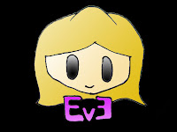 second attempt & further developments
 without tones; just flat colours.
 with tones
Tuesday, September 4, 2007
My Style.My design philosophy is more towards simplicity.
I prefer using bright colours, rather than just black and white when it comes to my design, unless it is required in my work.
My art style is more targeted at the children's age group, as they are portrayed more "cute" and brightly coloured.
Here are some of the graphic designs/logo i came up with.

personal logo.

flower graphic design.

graphic designed for me and my friends.

MTV logo.
Wednesday, August 29, 2007
Noel Martin- chosen inspired designer.Noel Martin is borned in
April 19,
1921.
He is an American
graphic designer, and he also studied drawing, painting, and printmaking at the Art Academy of Cincinnati, where he later became an instructor.
He is self-taught in typography and design, which are now his main activities.
From 1947 to 1955, he was assistant-to-the-director of the Cincinnati Art Museum, and an instructor at the Art Academy in Cincinnati from 1951 to 1957.
He has been the Museum’s designer since 1947.
He began working as a freelance graphic designer and art director for educational, cultural and industrial organisations in 1949.
His clients included United Fine Arts Fund, Westab, Standard Oil of Jersey, and General Electric,and more.
His philosophy.· “There’s an absolute rightness of geometric form.”
( In other words, he believes that graphic logo and typography design should have a symmetrical presence in them. )
· “Graphic design is not a stepchild of modern art.”
· “Good typography for magazines is generally typography which is free of animation and the necessary tricks of advertising, and is functional.”
· “Development of the form of modern typography follows a logical sequence…”
Below are some logo design and art works of his.
Advance Mortage
Westab
Music Cincinnati
 Xomox
Xomox
Repeated Three Times, 1969
Acrylic on canvas
36 x 36 inches
Grid of four, 2004
Each of the 12 x 24 inch acrylic on canvas paintings may be purchased in a grouping of two or four
Flexible English Curve, 1966
Acrylic on canvas
30 x 18 inches
Untitled, 2006
Acrylic on canvas
24 x 36 inches
Why him?
Noel Martin can be link to the era around the 60's because the birth of advertising was around that period of time.
The reason why i chose Noel Martin is because of his strong passion for graphic designs and typography, just like I do.
In addition, I feel that his beliefs in symmetrical lines in design are interesting too.
Through my research, I realised he is a person who has got his own stand and personal way of thinking, and do not follow the flow as easily as most people do.
Somehow, it creates my admiration for him in this aspect of him as well.
References:


